Lintasarta Cloud Service Portal

Lintasarta Cloud Service Portal

Designing the Lintasarta Cloud Service Portal involved leading efforts in design and optimization, creating a comprehensive application that encompasses a diverse range of cloud features.

Designing the Lintasarta Cloud Service Portal involved leading efforts in design and optimization, creating a comprehensive application that encompasses a diverse range of cloud features.

OVERVIEW

Role & Responsibility
UI/UX Designer - User Research, Interaction Design, Visual design, Prototyping & Testing
Project Type
B2B (Enterprise Cloud Platform)
Timeline
6 Month
Platform
Website Apps
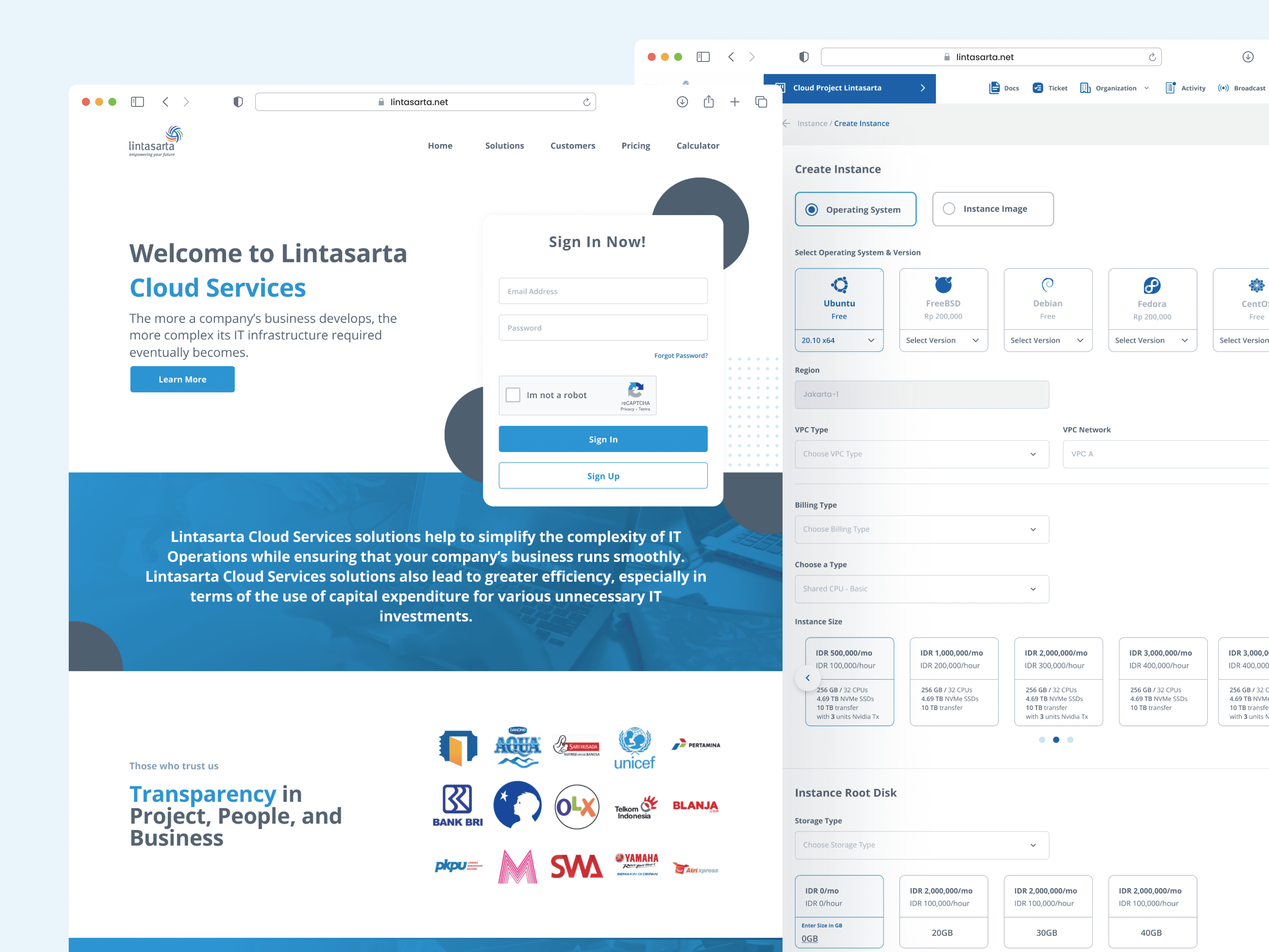
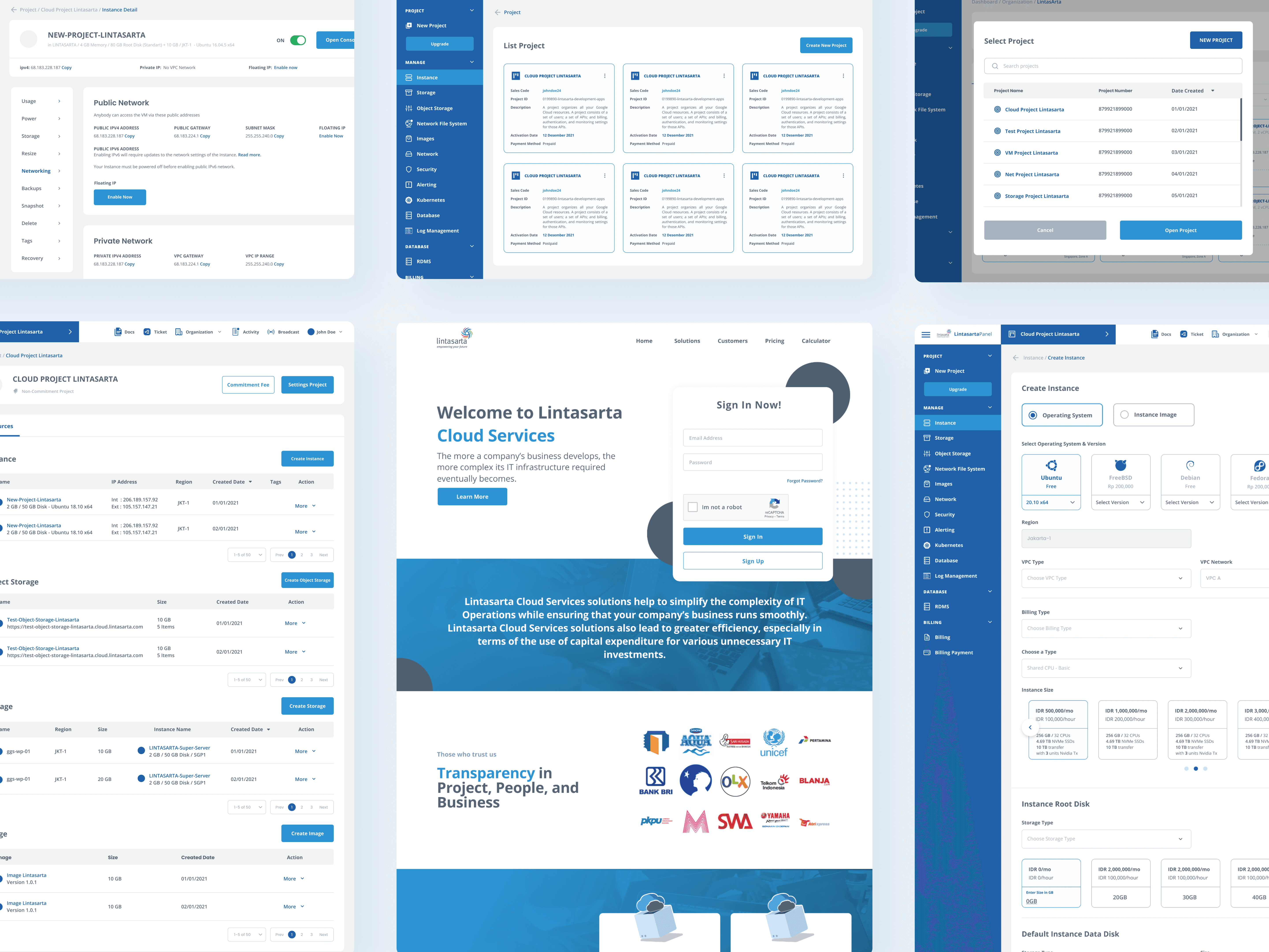
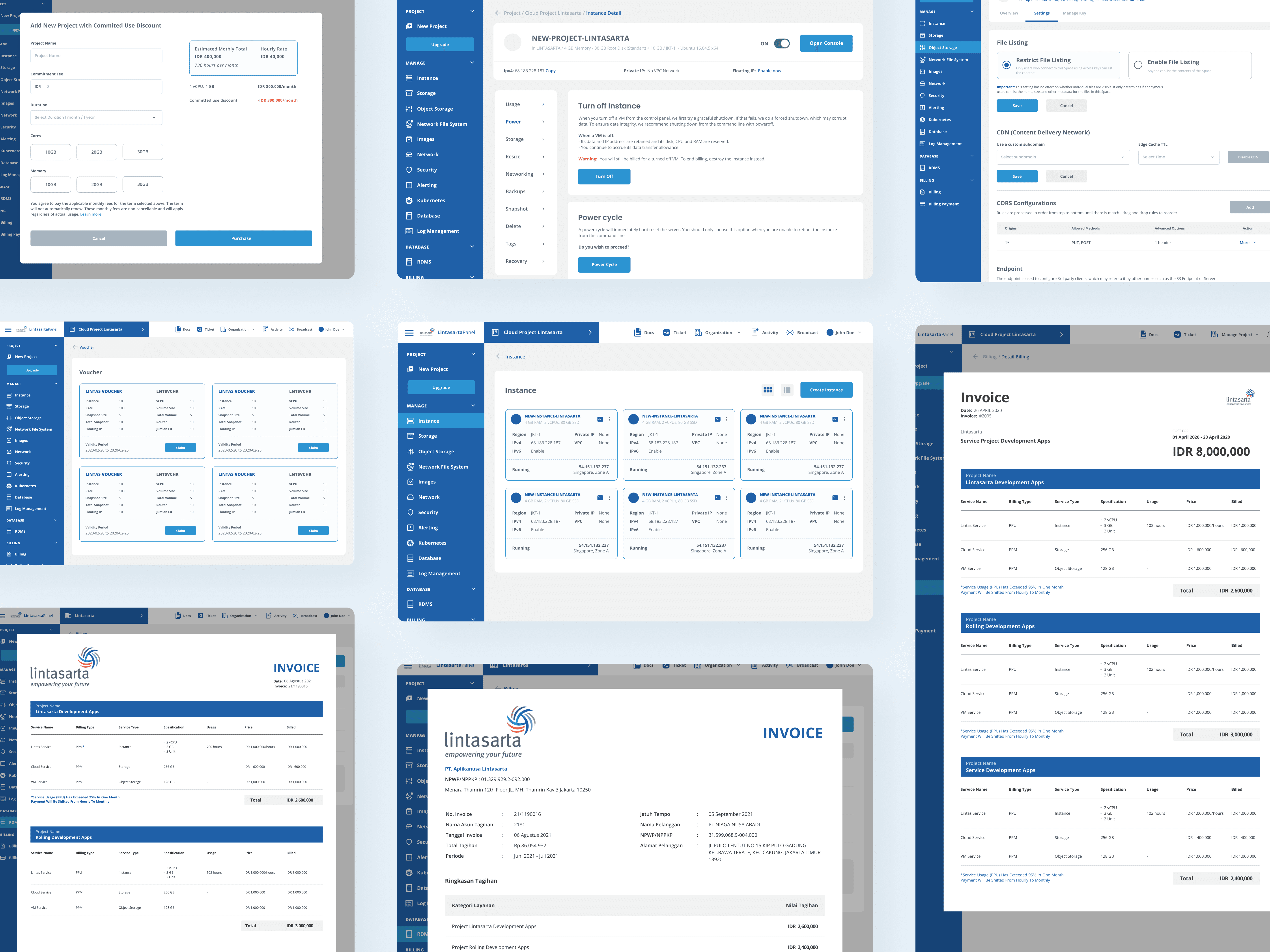
Lintasarta Cloud Service is B2B enterprise cloud management platform designed to unify Lintasarta’s diverse cloud services into a single, centralized portal. The project focuses on improving usability, accessibility, and operational efficiency for corporate IT teams by providing a more intuitive interface to manage, monitor, and operate cloud infrastructure securely and efficiently.

ABOUT COMPANY

Lintasarta Cloudeka is a cloud service provider under Lintasarta, delivering enterprise-grade cloud infrastructure and services for corporate clients across various industries. Its offerings include compute, storage, networking, security, and managed cloud solutions tailored for business-scale operation

FINAL MOCKUP

CHALENGGES

Key Challenges in Managing Lintasarta’s Cloud Ecosystem

The main problems that became my reference in making this application design are as follows
Unified Cloud Portal Initiative

As Lintasarta’s cloud services expanded, separate systems created fragmented and inefficient user experiences. Customers had to manage multiple portals with no consistent interface. This project aims to unify all cloud services into a single, simple, and efficient portal.

Improving Business Efficiency Through a Unified Platform

From a business point of view, using multiple separate systems caused higher support costs and made the services harder to use. Many customers struggled to adopt the services, depended on manual support, and faced slow onboarding processes.

Simplifying Cloud Operations for Corporate IT Teams

Corporate IT teams faced complex, time-consuming workflows due to unintuitive systems and lack of centralized visibility, forcing them to switch between multiple tools for a single task.

PROJECT GOALS

Building a Scalable and User Centric Unified Cloud Portal

How might we design a unified cloud service portal that enables enterprise IT teams to manage complex cloud services efficiently, securely, and intuitively in one centralized platform?

COMPETITIVE ANALYSIS + THE GAP

Market Learnings & Opportunities for Lintasarta

To understand industry standards and identify opportunities, a competitive analysis was conducted against three major cloud platforms: DigitalOcean, Google Cloud Platform, and Amazon Web Services.
Aspect
Digital Ocean
Google Cloud
AWS
Target Market
SMBs, developers
Enterprises & developers
Enterprises at scale
UI Complexity
Low
Medium
High
Navigation
Simple & flat
Structured but dense
Highly nested
Onboarding
Very friendly
Moderate
Complex
Branding
Friendly, modern
Clean, technical
Functional, utilitarian
Opportunity/What could be improved
  • Focus on enterprise clarity as the target market

  • Avoid unnecessary UI complexity

  • Ensure clear navigation and hierarchy

  • Improve the first-time onboarding experience

  • Create a more professional, enterprise-level brand tone

USER INTERVIEW

Analysis of User Interview Results

To gain a deeper understanding of user behavior within the market, and due to limited timeline and budget, the research was conducted through stakeholder discussions, internal team feedback, and client insights derived from support tickets and usage behavior.
Key Insight: After collecting the survey results, I listed 3 key findings. Here's what was decided after discussing the survey results
Navigation & Discoverability

Users struggled to find specific services due to inconsistent navigation and layouts.

Operational Efficiency

Simple tasks required too many steps, and critical processes still relied on manual workflows.

Visibility & Control

Users lacked a clear overview of service status, with monitoring scattered across multiple systems.

IDEATION

Collect Insight & Brainstorming

During an hour long "brainjam" session with the Product Manager. We identified three main focus areas to be implemented in this project.
Dashboard & Visualization

A unified dashboard with real-time metrics, role-based customizable widgets, and clear resource topology visualization.

Automation & Efficiency

Streamlined operations through one-click deployments, automated scaling rules, and scheduled backup and maintenance.

Monitoring & Alerts

Centralized alerts, performance analytics, and cost optimization insights to improve system control and efficiency.

LEASON LEARNED

Reflection & Takeaways

Key Learnings from the Project

Designing B2B enterprise products requires balancing complexity with usability, prioritizing user roles over visual trends, and focusing on clear structure rather than feature overload.

Opportunities for Improvement

Future iterations could benefit from deeper user interviews, quantitative usability testing, and further optimization for advanced enterprise use cases.

Let’s Discuss

Planning a project?

Let’s Discuss

Planning a project?

Let’s Discuss

Planning a project?

Create a free website with Framer, the website builder loved by startups, designers and agencies.